Clients have been asking lately about how to track print ads. In other words, people want to know how to track that a person saw the ad and then visited the website. This is a great question and one that’s near and dear to my heart. Why? I like showing results for marketing campaigns.
My first response is always, “Create an ad that has an offer.” With this type of print ad, you offer something for free: a white paper, a demo, a video, something of value that people will want to read or see. You then send people to a landing page where they usually (but not always) fill out a form to get the offer.
To give you some good examples, I began searching the most recent issue of Manufacturing Engineer. I did find lot of ads with offers, but many of them needed some help with their calls-to-action (CTAs).
Improvement #1: Add a URL with that QR code
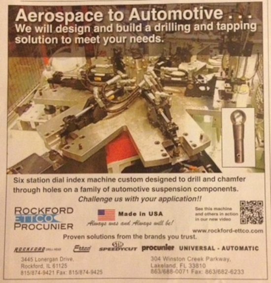
The Rockford Ettco Procunier print ad uses a QR code as its CTA: “See this machine and others in action in our new video.”
Since I didn’t have a QR code scanner app, I first went to the website to see if I could find the video but couldn’t immediately see it. And since the ad copy didn’t give the video a name, I wasn’t sure what to look for.
When you use a QR code as a CTA, you’re effectively asking people to take a huge step in the research / buy process, and that is, DOWNLOAD AN APP if they don’t have it, and then two, use their phone to take an action.
Given that B2B buyers still do the majority of their research using desktop machines (based on the Google Analytics data across my client accounts), the QR code CTA is rendered ineffective pretty fast.
If you’re dead set on QR codes, at least include a URL to the offer in the copy for those people who aren’t app savvy.
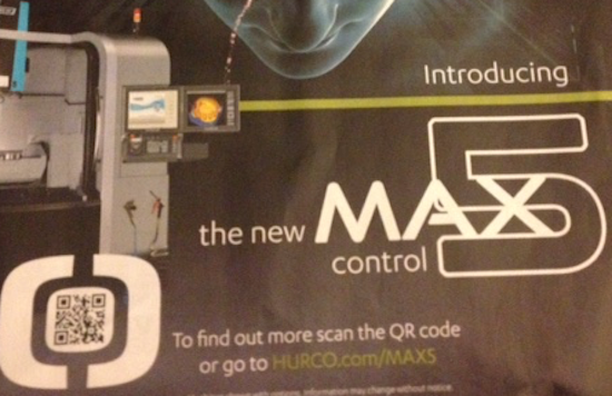
HURCO, a developer of machine control software, did include a URL next to its QR Code. As you can see in the screenshot, it’s easy to see, it’s clean, and it’s readable.
Improvement #2: Send people to a specific landing page you can track
Because I’m super diligent, I downloaded a QR code scanner app because I wanted to see where the Rockford QR code would take people who read the ad.
The QR code took me to . . . a YouTube video. Which is fine, I guess. But since I was on my phone, I couldn’t figure out how to get to the company website from the video because the website URL was missing from the video description.
So two strikes for this ad and its QR code CTA.
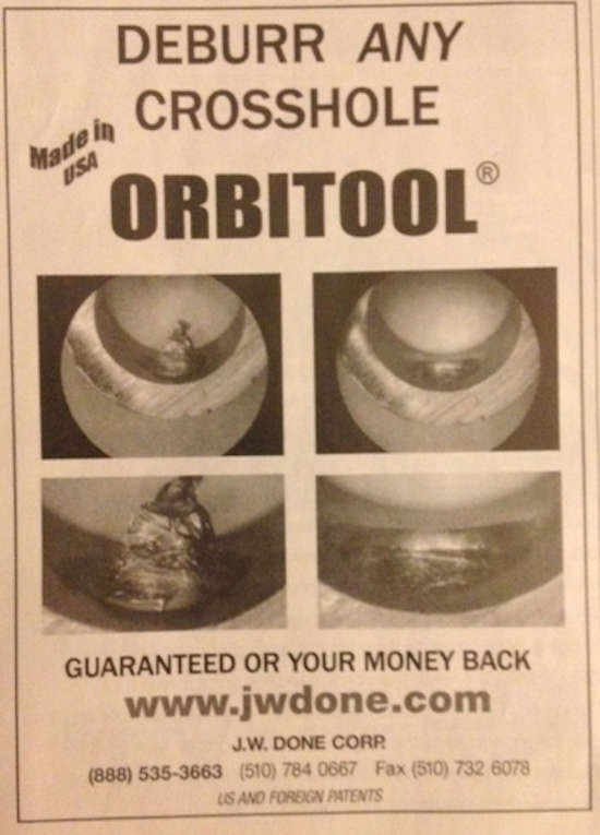
I do like the J.W. Done Corp ad. It’s clean and well laid out. The message is simple: “Deburr any crosshole.” The problem: The ad sends people to the home page, which you can’t track.
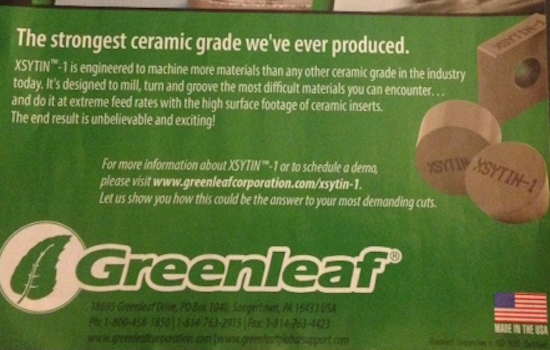
Greenleaf Corporation, manufacturers of ceramic products, on the other hand, does have a trackable URL in its CTA, which states readers can schedule a demo. I like this CTA because it fits in with the ad copy, which is full of energy.
Improvement #3: Match the landing page copy with the CTA
So I clicked through to the Greenleaf landing page — and it’s actually quite good. But, where is the demo? The copy states I have to fill out a form to get information about the product. What do I do if I want the demo?
Ditto for the HURCO ad already mentioned. When I typed the URL into my browser, I was taken to one of those web pages where content and images appear as you scroll. I was immediately overwhelmed and clicked back out. Ack! (I *really* dislike those types of websites. So distracting!)
Improvement #4: Keep your CTA clutter free
Another problem associated with the Rockford CTA is that it’s a little lost in all the ad clutter. Greenleaf’s CTA is strong, but it, too, is a little cluttered with too many words around it.
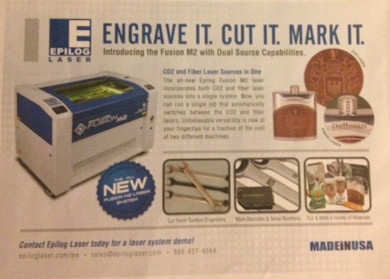
Epilog Laser, on the other hand, does everything right.
The strong CTA, in blue, is at the bottom left of the ad: “Contact Epilog Laser today for a laser system demo!” The “/me” in the URL stands for “Manufacturing Engineering,” which means the company can track how many responses it gets from this trade publication — a great tactic if you’re running the same ad in multiple publications.
And last but not least, the landing page copy matches the CTA. The page includes a 24 minute video demo and a CTA to request the video demo DVD, a brochure, and samples. Very nice indeed!
When crafting print ad calls-to-action, remember that people are busy and distracted. To increase conversions, make it easy for them to go from offline to online by:
- Keeping your print ads clean and clutter free
- Including a URL to specific landing page so that you can measure response
- Matching landing page copy to the CTA offer
Thoughts? Feedback? Leave your comments.



Rachel Cunliffe
Great tips Dianna! Fascinating to see current examples of ads which are still in need of a lot of improvement.
Dianna Huff
Thank you!